
Shopify is an amazing eCommerce website but it’s expensive too. While there is no magic pill to churn out big numbers, there are some web design mistakes most eCommerce businesses and brands make.
Are you one of them bamboozled look at the dismal sales figures? The good news, we are here to list out 7 Shopify web design blunders that may be pushing away customers.
Without much ado, let’s find out.
Poor site product search
There is a difference between searching dozens of products and hundreds of similar-looking products on a Shopify store. Do not make it hard for shoppers to find the relevant products according to their preferences and budget.
Instead of the standard product search, how about integrating a Shopify filter app? There are many powerful apps out there that reduce the time and effort to find the right product based on criteria like color, size, and brand.
If you’re not doing it, that only makes it difficult for shoppers to select and buy a product from your site. Simplify the user’s journey on your website and soar the chances to boost lead conversion and sales.
Poor quality product images
Good quality images can sell your products like hot potatoes. Do you hear us? If not, then you got to pull your socks and go for professional product photography for your eCommerce business.
From the background to the lights, props, and more, everything matters to get top-quality product images that
- display the product information clearly
- highlight the USP of the products
- stresses upon the overall look or style of the product
- give that slight nudge some shoppers need to make the purchase
This applies to products that fall in the category of apparel and interior design brands. Get premium visuals for your site to capture the attention of casual shoppers and high-intent users alike.

Poor loading time
It is a matter of few seconds before a shopper jumps to another store if you’re site is taking eons to load. Irritated and annoyed at the shocking loading time can put off shoppers like anything else.
Have a word with your web designers and get the page load speed fixed. Improve on that using advanced tools and techniques. A slow website only makes sluggish sales; always remember that.
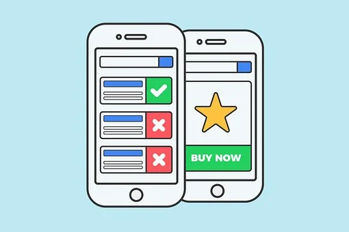
Poor CTAs
It’s good if you’ve hundreds of products for shoppers but what’s the point if they are lost in that grid?
Create a compelling call to action (CTA) that directs shoppers to the checkout page and then the final transaction. Do not complicate the process and instead have CTAs that are
- crisp and clear
- optimized for action
- not random and directionless
- strategically placed
- bold and discrete

Poor navigation
Poor navigation casts doom for your site’s lead conversion rate. If not intuitively designed, your shoppers will be left confused, let alone converting for the store.
Not just that, your site will receive less traffic and hence poor site ranking.
- Remove irrelevant links from the navigation bar
- Long and random text labels serve no purpose
- Navigation bars not optimally designed for different screen sizes are useless
- Too many sub-menus leave users confused
Fix it without any wait. Trust the industry pros when they say, poor navigation can turn everything good on your website worthless.
Poor content
Just because it is a product page that doesn’t mean the content is not important. Work on a high-quality product description that is
- Clear and concise
- Easy to read and scan
- Descriptive to drive sales
- Accurate and factually correct
- Optimized for SEO performance
Write product descriptions that add value to the page. Helping users and impressing Google bots alike.
Poor layout
A product page is not meant for marketing and promotion. It is for lead generation and fueling sales. Do not stuff it with unnecessary content, images, or videos that serve little to no purpose.
Distribute the content in a way that shoppers can absorb it and effortlessly clicks on the CTAs. It should be intuitive enough for users to find and click on convertible elements of the page.
Do not forget that users may need extra information, so be available to answer questions 24/7. Integrating a chatbot could take you to places.
In the end, Shopify is the best eCommerce platform for a reason. Yet there are web design mistakes that many businesses make that can dig a hole in your pocket.
Fix your web design for if you are users are unhappy, there’s no chance you can push them down the sales funnel.
If unsure, get a website audit done by professionals that can pinpoint areas where you need to work on. Share your feedback in the comments section below.
Follow Techrado for more!