The Aesthetic-Usability Effect is the cognitive bias that demonstrates users are willing to forgive minor usability issues if the design is visually appealing. This is an important principle to consider when creating aesthetically pleasing web designs.
However, designers must be careful not to prioritize form over function. As Don Norman notes in his NN Group website study, a beautiful hero image may entice users, but they will become frustrated if they can’t complete tasks easily.
Aesthetic-Usability Effect
The Aesthetic-Usability Effect is a fundamental principle that underscores the importance of balancing form and function when designing digital products. It was established in the 1990s by researchers Masaaki Kurosu and Kaori Kashimura, who found that users preferred products that seamlessly blended aesthetic appeal with functional efficiency. This insight has since become a guiding principle in UX design, encouraging designers to consider both the visual elements of their designs and the user experience they create for their audiences.
In their experiment, Kurosu and Kashimura applied 26 layout patterns to participants and asked them to evaluate each interface in terms of its inherent usability and apparent beauty. They found that the apparent beauty of an interface was much more correlated with its actual usability than its inherent beauty. The aesthetic-usability effect suggests that people are more receptive to problems with a product if it’s visually appealing. This is why users tend to forgive minor usability issues in apps and websites that look polished and professional.
For example, when booking a hotel room on Airbnb, users are more likely to complete the booking process if it looks attractive and easy to use. This is because the user experience of booking a hotel room is more than just about functionality; it also involves creating a connection between the customer and the brand.
As such, aesthetically pleasing interfaces can help businesses establish customer trust and credibility. However, it is important to note that if a product prioritizes aesthetics over usability, it will not be able to sustain itself in the long run. Inconsistent design and an uneasy user experience will cause users to lose patience and abandon the product.
Visual Hierarchy
Visual hierarchy is a design principle that organizes elements to draw the eyes toward the most important content. It leverages size, color, and contrast to communicate priority, guiding the eye and providing clear navigation for users.
It’s also important to consider how things interact with one another in a design, as this impacts interpretation and understanding. Proximity is the idea that related items should be closer together while unrelated items should be farther apart. Spacing can also impact hierarchy, as can alignment and repetition. When used wisely, these techniques can help a designer create a hierarchy that works.
The first step to creating a good visual hierarchy is understanding the basics of Gestalt psychology, which states that people perceive objects as more important when they are larger and more dramatic than their surroundings. This is why a large, bold font can make a headline stand out on a page, even when it’s the only text. The next step is determining which elements to emphasize in your design. This is why some designers choose to break the grid, placing their visuals haphazardly in order to make them stand out against surrounding grid-locked text.
Other important factors in creating a good visual hierarchy include using spacing and white space to create breathing room for the user. This makes the elements easier to read and can also make them feel more expansive, increasing their importance in the eyes of the viewer. Additionally, consistency is a great tool to use when establishing a hierarchy. When an element repeats throughout a design, it is easy to recognize and understand its role. For example, using the same font style and color to indicate a hyperlink helps your audience know where to click.
Colors
The use of colors is important in web graphics for several reasons. It can make them look appealing to users and help convey information in an organized and logical way. Colors can be used to highlight important elements of a graphic, and it is recommended that designers follow web-safe color schemes for the best results.
Another reason to consider the use of colors in web design is that it can be helpful for users who are visually impaired. For this reason, it is important to include textual equivalent alternatives for graphics on your website. This can be done by using the alt attribute on an image tag. For more information on this, please refer to the section on Graphics Markup in the Web Style Guide.
One of the main differences between graphics and multimedia is that multimedia incorporates the use of multiple mediums to present information, while web graphics only use visual images to represent information. This can make a difference in file size and loading time, which are both critical factors for the success of websites.
Web graphics can be in the form of photos, maps, family trees, drawings, designs and patterns, engineering and architectural blueprints, diagrams, typography, line art, and schematics. In addition, they can be animated and interactive to engage users and improve usability.
The aesthetic-usability effect is a cognitive bias that shows that people are more likely to choose products with attractive visuals than those with less appealing aesthetics. This can be a problem for web designers who may be tempted to prioritize their product’s visual appearance over its functionality. Fortunately, there are ways to avoid this problem by ensuring that your product’s visual appeal and usability are aligned.
Symbolism
A symbol is a visual representation with symbolic value and can represent something else without having any direct or physical relationship. Symbols often have deeper meanings than the actual thing they represent, and they can communicate things that would be difficult to convey with literal images. For example, a long, flowing mane of hair can symbolize a period of youth or innocence. The cutting off of that hair, in the form of a dramatic scene in a novel or movie, can communicate a character’s loss of that innocence and the sacrifices they must make to achieve adulthood.
Symbols are useful in Web graphics because they can help guide viewers’ attention, making the page more appealing and easier to read. However, designers should be careful not to overuse these elements. Too many strong graphic elements on a single page can compete for attention, leading to an overly busy or cluttered look that makes it hard to find the information you’re looking for. Additionally, if these elements aren’t consistent with one another, they can confuse users by leaving them wondering what the page’s intended purpose is.
Graphics are an essential part of any website, and it’s important for Web designers to understand how aesthetics and usability interact. A web design that prioritizes aesthetics without focusing on usability can cause users to abandon a site. Conversely, a site that focuses solely on usability can lose its attractiveness.
It’s also important to remember that not all users can see visual content. This means that all graphics must be accompanied by textual equivalent alternatives or descriptions of the image to improve accessibility. This is usually done using alt attributes.
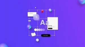
Typography
Typography is a key element that must be carefully considered when creating a web design. Your fonts should be legible and easy to read while remaining aesthetically pleasing. There are several aspects of typography that need to be taken into consideration, including color, weight, and alignment. In addition, you should also be aware of spacing, which refers to the amount of space between letters. For example, serif fonts tend to require more space than sans-serif fonts. Using the right spacing can help to improve legibility and make the text easier to read. Another aspect of typography is tracking, which refers to the spacing between individual letters in a word. A good designer will know how to properly adjust the tracking of each word in order to ensure that the text is readable and does not appear cluttered or uneven.
A lot of information needs to be displayed on a website, so it is important to use clear and descriptive labels as well as a well-organized layout. This will make the website easy to navigate and provide users with a positive experience.
The relationship between aesthetics and usability is often a delicate one. Aesthetics is highly subjective and varies from person to person, while usability is more objective and focuses on the user’s ability to easily achieve their goals. Striking a balance between these two aspects of web design can be difficult, but it is essential to the success of any website.
The most successful websites are those that have a harmonious relationship between aesthetics and usability. Aesthetics can influence a site’s credibility and perception, while usability is the most important factor in keeping visitors engaged and returning to the site.